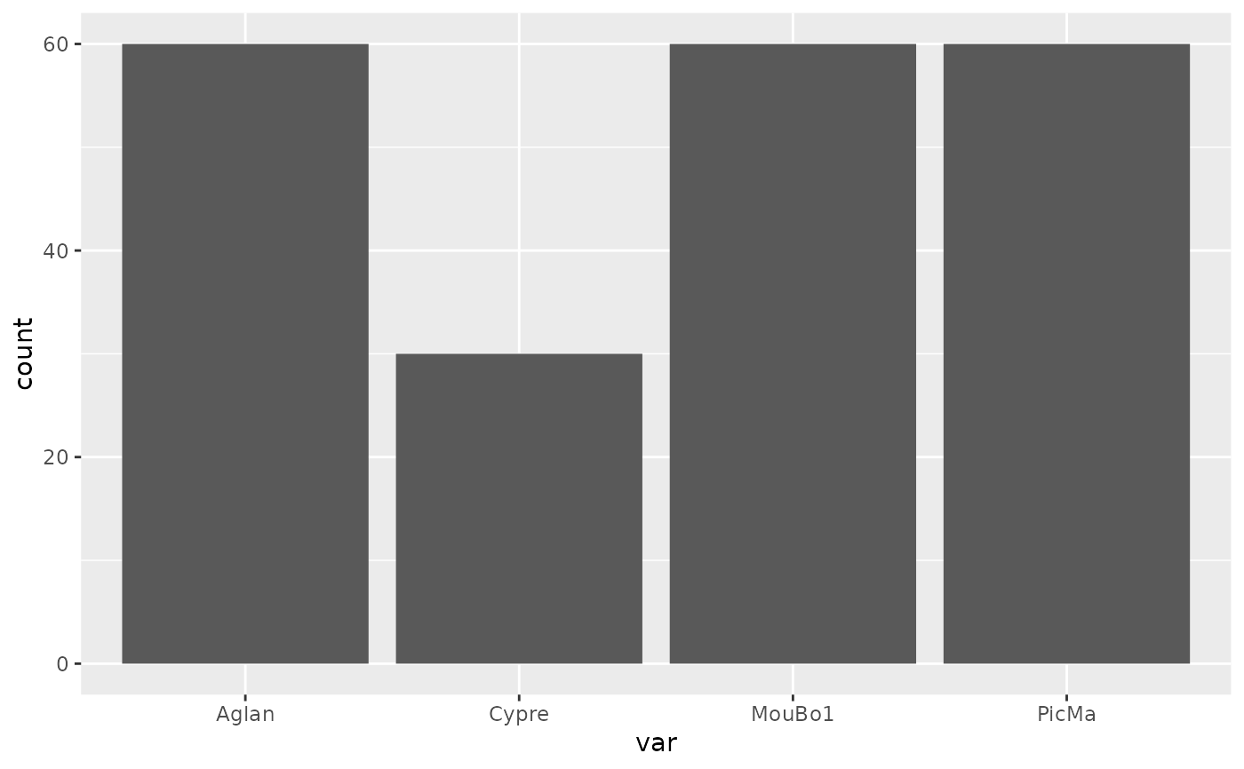
An utility that plots a confusion matrix of sample size (or a barplot) for every object with a $fac. Useful to visually how large are sample sizes, how (un)balanced are designs, etc.
See also
Other plotting functions:
coo_arrows(),
coo_draw(),
coo_listpanel(),
coo_lolli(),
coo_plot(),
coo_ruban(),
ldk_chull(),
ldk_confell(),
ldk_contour(),
ldk_labels(),
ldk_links(),
plot_devsegments()
Examples
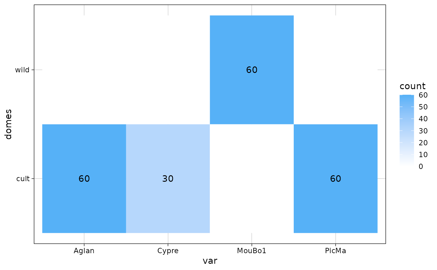
plot_table(olea, "var")
#> Warning: `select_()` was deprecated in dplyr 0.7.0.
#> ℹ Please use `select()` instead.
#> ℹ The deprecated feature was likely used in the Momocs package.
#> Please report the issue at <https://github.com/MomX/Momocs/issues>.
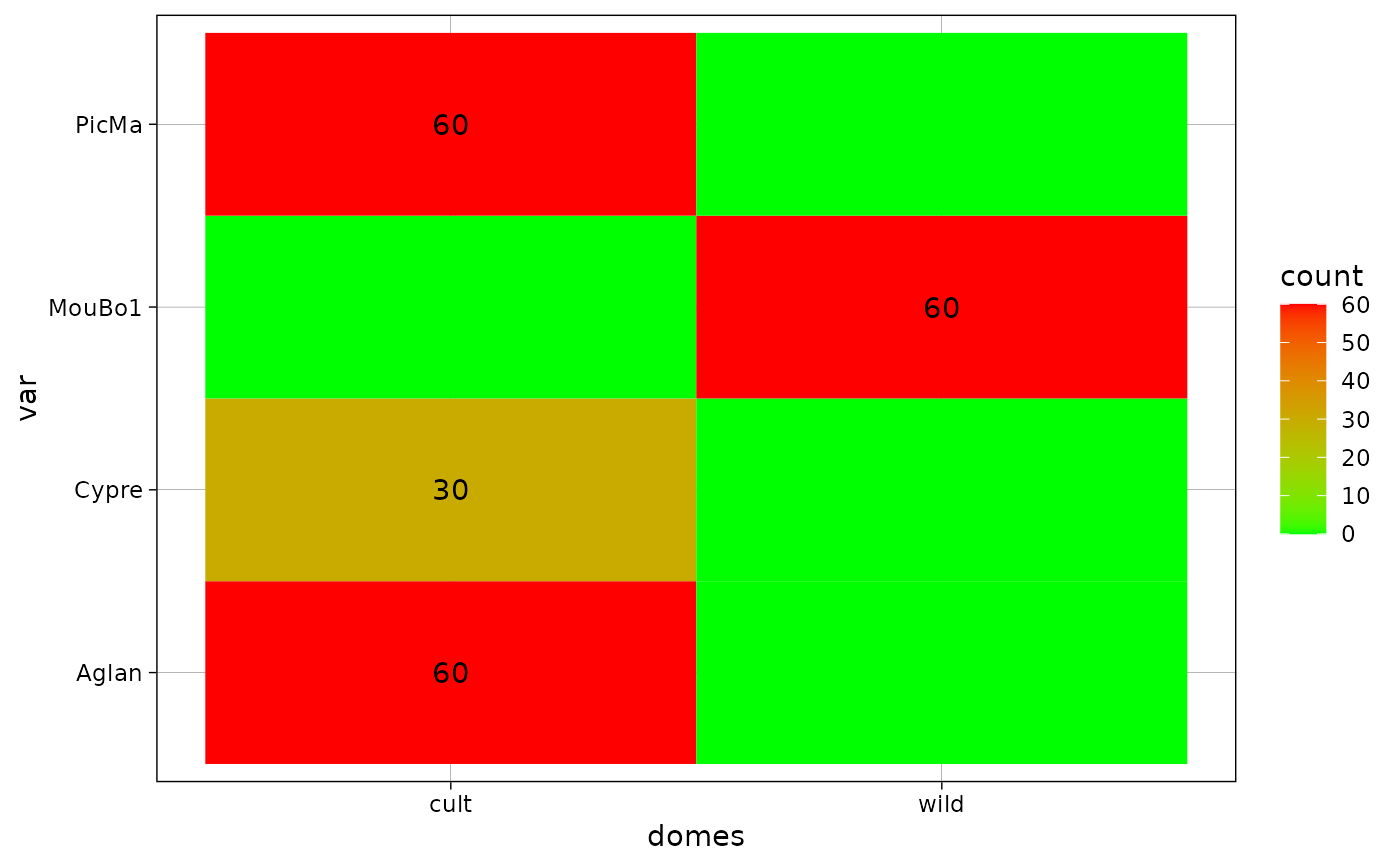
 plot_table(olea, "domes", "var")
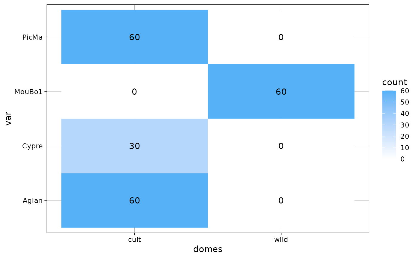 gg <- plot_table(olea, "domes", "var", rm0 = TRUE)
gg
gg <- plot_table(olea, "domes", "var", rm0 = TRUE)
gg
 library(ggplot2)
gg + coord_equal()
library(ggplot2)
gg + coord_equal()
 gg + scale_fill_gradient(low="green", high = "red")
#> Scale for fill is already present.
#> Adding another scale for fill, which will replace the existing scale.
gg + scale_fill_gradient(low="green", high = "red")
#> Scale for fill is already present.
#> Adding another scale for fill, which will replace the existing scale.
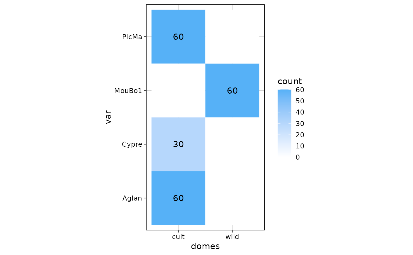
 gg + coord_flip()