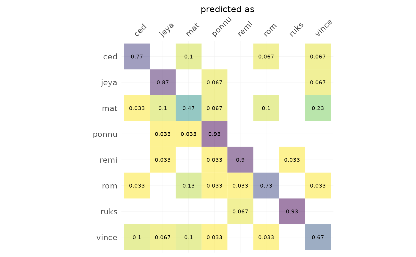
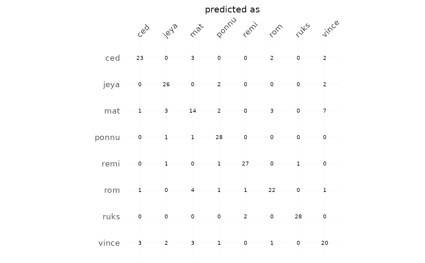
Either with frequencies (or percentages) plus marginal sums,
and values as heatmaps. Used in Momocs for plotting cross-validation tables
but may be used for any table (likely with freq=FALSE).
Usage
plot_CV(
  x,
  freq = FALSE,
  rm0 = FALSE,
  pc = FALSE,
  fill = TRUE,
  labels = TRUE,
  axis.size = 10,
  axis.x.angle = 45,
  cell.size = 2.5,
  signif = 2,
  ...
)

# Default S3 method
plot_CV(
  x,
  freq = FALSE,
  rm0 = FALSE,
  pc = FALSE,
  fill = TRUE,
  labels = TRUE,
  axis.size = 10,
  axis.x.angle = 45,
  cell.size = 2.5,
  signif = 2,
  ...
)

# S3 method for class 'LDA'
plot_CV(
  x,
  freq = TRUE,
  rm0 = TRUE,
  pc = TRUE,
  fill = TRUE,
  labels = TRUE,
  axis.size = 10,
  axis.x.angle = 45,
  cell.size = 2.5,
  signif = 2,
  ...
)
Arguments
- x
a (cross-validation table) or an LDA object
- freq
logical whether to display frequencies (within an actual class) or counts
- rm0
logical whether to remove zeros
- pc
logical whether to multiply proportion by 100, ie display percentages
- fill
logical whether to fill cell according to count/freq
- labels
logical whether to add text labels on cells
- axis.size
numeric to adjust axis labels
- axis.x.angle
numeric to rotate x-axis labels
- cell.size
numeric to adjust text labels on cells
- signif
numeric to round frequencies using signif
- ...
useless here
See also
LDA, plot.LDA, and (pretty much the same) plot_table.
Examples
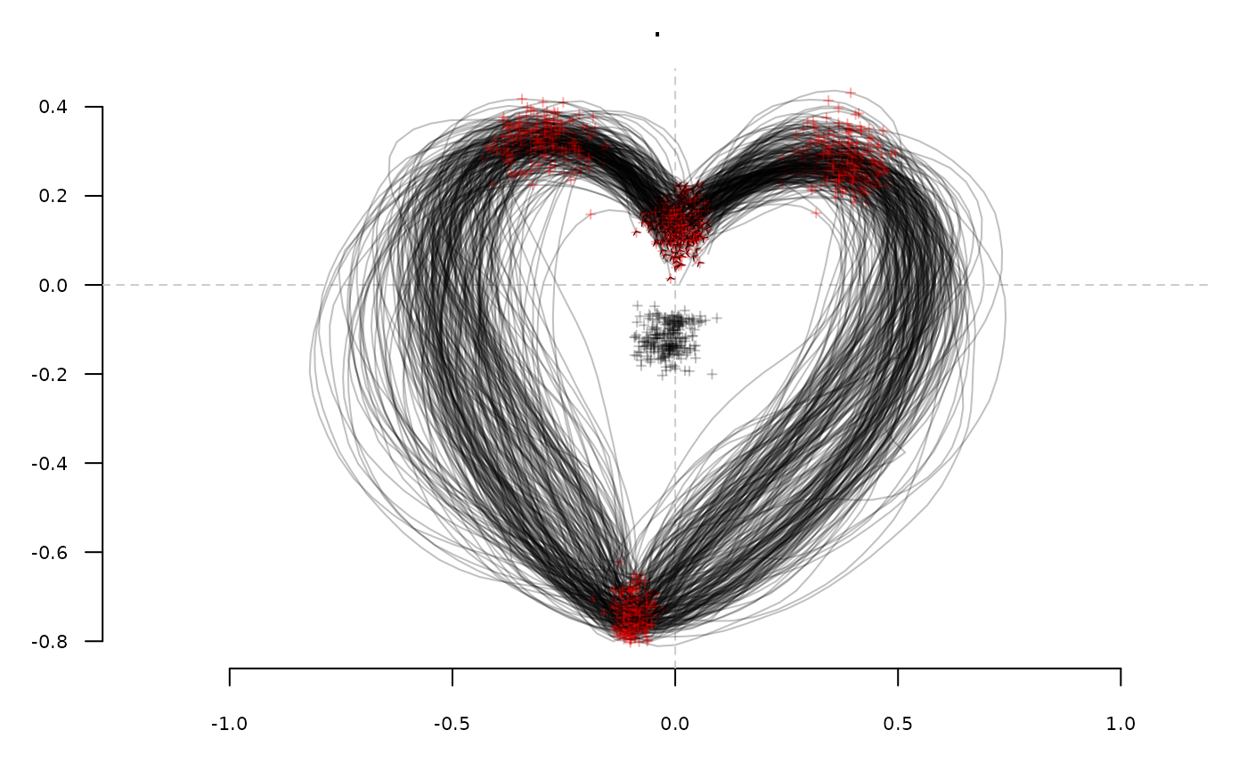
h <- hearts %>%
     fgProcrustes(0.01) %>% coo_slide(ldk=2) %T>% stack %>%
     efourier(6, norm=FALSE) %>% LDA(~aut)
#> iteration:  1 	gain: 30322
#> iteration:  2 	gain: 1.2498
#> iteration:  3 	gain: 0.34194
#> iteration:  4 	gain: 0.0062954


h %>% plot_CV()

h %>% plot_CV(freq=FALSE, rm0=FALSE, fill=FALSE)

# you can also customize the returned gg with some ggplot2 functions